
Our entry to the Wellcome Data Reuse Prize
We came second!
This is a very exciting post to write. I’m currently on a train to London, to attend the ‘Eliminating Malaria: evidence, impact and policy’ meeting at the London School of Hygiene and Tropical Medicine.
Myself, Josh Longbottom and Andy South recently submitted an entry to the Wellcome Data Re-Use Prize.
The task was to use the data provided by the Malaria Atlas Project (MAP), and do something novel and interesting with it, under these categories:
- Exploring novel explanations for unattributed residual malaria transmission present in MAP’s statistical models.
- Novel approaches to ‘down-scaling’ of areal incidence data provided by MAP for three endemic countries for which case -totals (corrected for treatment-seeking and reporting biases) are available at a range of spatial scales.
- Visualising the measures of uncertainty associated with MAP’s typical modelled outputs.
MAP collates geographic data relating to malaria from many sources. This data is rich and extremely useful to researchers working on malaria in Africa. Such comprehensive data repositories typically require a programming language to explore. Given that the global effort against malaria encompasses many fields, disciples and skill sets, it means that this valuable resource may not be accessible to all the people who may want to easily access the data.
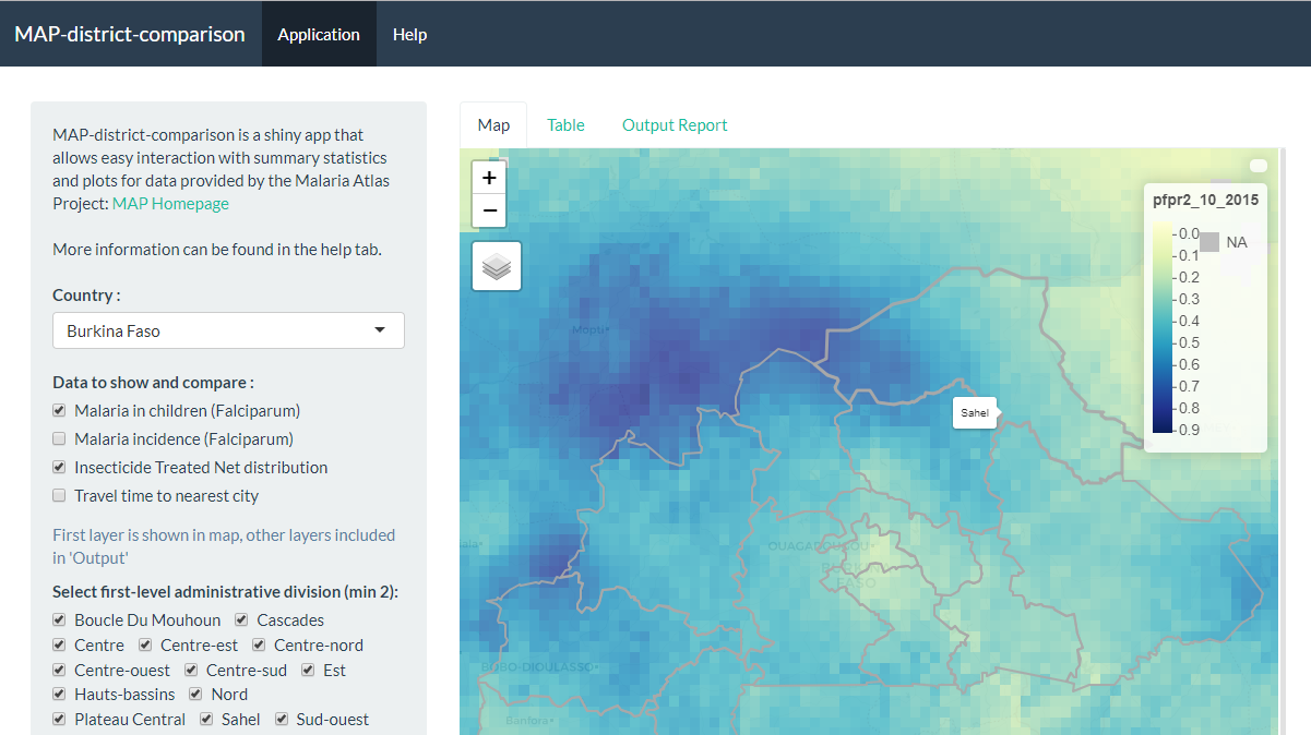
Our idea was to develop an interactive and dynamic shiny application that allows users to graphically interact with MAP data, comparing districts within African countries and providing summary statistics for malariometric indices in areas of interest.
I’m very proud of the application, which can be found here by the way.
We found out on World Malaria Day that our submission placed 2nd in the competition. Carrying a prize of £5000, an invite to a meeting in London on the 30th (hence the train), and an invitation to publish a descriptive piece in the Wellcome Open Research journal.
For those of you who are interested, below I’ve pasted the original submission text, which gives a more formal overview of the context, methods and development of the application.
This is the first academic competition I’ve entered, and whilst it was difficult to balance PhD work and this extracurricular, I’m very glad that we did it and I’ve learned a lot from it. I’d be more than happy to take part in similar competitions in the future. At the moment I’m working on my submission to the Max Perutz Science Writing Award. The requirement is 800 words describing your research, why it interests you and why it’s important to a general audience. It’s a difficult task, to write clearly for a general audience, and I’ve already learned lots about where my weaknesses are for this type of writing. Being able to clearly communicate your research to the general public is a vital skill that all scientists need to have, and I’m using this exercise work on my public engagement writing.
That’s all for now. See you in the next post.
Original submission.
MAP-district-comparison: An interactive shiny application for summary statistics and visualisation of MAP data. Joshua Longbottoma, Andy Southa and Sean Tomlinsona
a Department of Vector Biology, Liverpool School of Tropical Medicine, Liverpool, UK
Introduction
The malariometric data generated by the Malaria Atlas Project (MAP) has the potential to influence policy at the national and subnational level; the greatest utility for the data is inferring disease burden at non-sampled locations through model interpolation [1]. Whilst these data are a valuable resource for research and public health professionals alike, there has been relatively poor uptake by implementation programmes. For the data to be used by operational staff at a local level, there is a requirement for additional tools and the ability to convert such data into operationally useful metrics [2]. We present a prototype user interface demonstrating how MAP data could be made more accessible to national and local decision-makers in Africa. Most MAP data are provided as a 5 km x 5 km grid. Whilst this provides a visual indication of subnational disparities, it is not clear how these data could be used directly in operational decision making. Within-country decision making is commonly based around administrative units, for example, PBO and long-lasting insecticide-treated net distributions, and seasonal malaria chemotherapy are based on sub-district data [3]. The direct use of MAP outputs therefore requires interpretation of pixel-level trends across administrative divisions, presenting additional processing and barriers to use. MAP data can already be accessed online via an interactive map tool, a country profiles tool and the malariaAtlas R package [4]. While these are powerful tools for enabling access to MAP generated data, none yet provide data at the level of administrative units in a form that could easily be used by local decision makers. Here, we present an innovative application that allows the rapid generation and comparison of summary statistics for selected indicator variables, producing data at the administrative level aiding national and sub-national decision making.
Methods
We used the R coding language and the Shiny framework to develop an online user-interface which allows users to interact with African MAP data, providing summary statistics for select districts and surfaces. Shiny apps have the potential to revolutionise the ability of health practitioners and policy makers to interpret statistics and model outputs, through the simple interfacing of data. Within our application, users can select a country and districts of interest, alongside a selected list of malaria indicators as provided by MAP. We refined the list of data layers to create a simple and useable user-interface. Surfaces were obtained from MAP utilising the ‘malariaAtlas’ R package. These surfaces were then aggregated using administrative boundaries as provided by the Food and Agriculture Organisation of the United Nations (FAO), and the ‘zonal’ function within the ‘raster’ R package [5]. Boundaries and surfaces for display were simplified to make the user interface quick and responsive to user choices (i.e. reduction of polygon features and aggregation of spatial resolution). Ultimately, our application provides an easy way of allowing initial interfacing of MAP data, through interactive tables and bespoke user-generated reports. The code can easily be modified to include additional layers from MAP or elsewhere, once we understand the needs of the user community better. We suggest, however, that care is taken to maintain usability of the application and that the functionality remains within the scope of the targeted users, who are local decision-makers.
Identification of Novel Findings
We present a prototype user interface demonstrating how MAP and other data (such as FOA data) can be made more accessible to local decision makers. This work is novel in that it makes it easy to summarise and compare MAP data at the level of administrative units, through interactive tables and plots. It is also novel in providing open-source R code that can be edited easily to include other data layers, calculations or visualisations, or to focus on particular geographic regions. Additionally, the application facilitates the generation of administrative level reports for countries which currently do not have easily accessible indicator reports available through the DHS Program. This includes data for countries such as Algeria, Guinea-Bissau, Libya, Somalia, Swaziland and Western Sahara. The formatted output reports enable quick access to summaries and trends within the MAP data; producing simple summary statistics vital for informing public health decisions. We reduce the barriers faced by key stakeholders to obtain contemporary malariometric estimates with a simple to use interface - one which can produce dynamically updated summaries as and when new outputs are produced by MAP.
Innovation of Approach
The presentation of summary statistics in an easy-to-use interface presents novel opportunities for public health professions to interact with this data resource, especially where a lack of R knowledge may have previously prevented individuals from recovering these statistics through the conventional workflow. Additionally, as MAP provides a vast array of malariometric and indicator variables, developing an application which hones in on a particular suite of variables enables ease of access to this wealth of data, ultimately reducing barriers to access, and encouraging continued interaction with the potential to deepen the complexity of requests. For example, our application was developed to show summary statistics and plots for the most impactful variables, however, the framework we have developed is receptive to any of the surfaces generated by MAP. By tailoring which surfaces are available within the app, we allow for a more streamlined and easy-to-use interface which reduces the likelihood that users become overwhelmed by the vast amount of data available. As a proof of concept, the application was developed for the African continent, however, future work may expand the inclusion to additional countries with endemic malaria transmission. By presenting publicly available data in such a way that it can be easily interacted with is an innovative way to increase public engagement and awareness of malaria trends. Finally, we will extend outreach by trialling the application within the GAARD and GAARDian network, who have expressed an interest both in the ease of access to MAP data, and in this application as a framework for visualising and interfacing their own data in the future.
Replication of Findings
The code and associated files that constitute the Shiny application are hosted on GitHub here. In addition, a live version of the application is hosted online and can be found here. For reasons of speed and computational efficiency, the application calls upon precomputed summary statistics for all available countries, districts and surfaces. The script that generates these statistics is located within the application root folder, so that it may be reviewed by others, despite it not being a file necessary for the running of the application.
Code
The code and associated files that constitute the Shiny application are hosted on GitHub here. In addition, a live version of the application is hosted online and can be found here.
Collaboration
All participating members of this team are new collaborators, with no shared publications. The team consists of two MRC DTP PhD candidates and a post-doctoral researcher; each member represents different research fields at the Liverpool School of Tropical Medicine.
References
Giorgi, E., Diggle, P.J., Snow, R.W., Noor, A.M. (2018). Geostatistical methods for disease mapping and visualization using data from spatio-temporally referenced prevalence surveys. arxiv.org/abs/1802.06359
Knight, G., Dharan, N., Fox, G., Stennis, N., Zwerling, A., Khurana, R. and Dowdy, D. (2019). Bridging the gap between evidence and policy for infectious diseases: How models can aid public health decision-making.
Gonahasa, S., Maiteki-Sebuguzi, C., Rugnao, S., Dorsey, G., Opigo, J., Yeka, A., Katureebe, A., Kyohere, M., Lynd, A., Hemingway, J., Donnelly, M., Kamya, M. and Staedke, S. (2018). LLIN Evaluation in Uganda Project (LLINEUP): factors associated with ownership and use of long-lasting insecticidal nets in Uganda: a cross-sectional survey of 48 districts. Malaria Journal, 17(1).
Pfeffer, D.A., Lucas, T.C., May, D., Harris, J., Rozier, J., Twohig, K.A., Dalrymple, U., Guerra, C.A., Moyes, C.L., Thorn, M., Nguyen, M., et al. (2018). malariaAtlas: an R interface to global malariometric data hosted by the Malaria Atlas Project. Malaria Journal, 17(1), p.352.
Robert J. Hijmans (2019). raster: Geographic Data Analysis and Modeling. R package version 2.8-19. https://CRAN.R-project.org/package=raster